5 Essential Elements Of Data Visualization
In September (2018 if you are reading this post in the future) I had an opportunity to conduct a workshop session during a conference called ML (Machine Learning) @ Enterprise. Topic of my workshop was “From Data to Actions” and it was meant to show all the steps in the process of working with data, from raw source extract, through transformation and finally ending on visualizations and insights.
As a bonus material I’ve prepared for attendees an infographic called – 5 Essential Elements Of Data Visualization – you can find a direct link to it at the end of this article.
This is a condensed information about 5 good practices in data visualization world, I thought that it would be fair to share a bit more details about each in a blog post. So please, enjoy the read, and let me know your thoughts in comment section down below.
Consistent style & colors
Company that you work for (or maybe your own company) may already have some set of standards in terms of: fonts, colors, graphics. Use it when designing your visualization layer in applications – adjust slightly if needed but try to keep it as close to the standards as possible.
However if you don’t have a set of rules set yet, it’s crucial to maintain the same style and colors across all visualizations.
Imagine if you are opening a chart with for example sales data by category of products and your highest values (bars) are colored with red. On the next chart you present open orders data by region where your highest values (bars) are colored with blue – does this makes sense?
We as humans are pretty lazy people, we are easily getting used to different stuff, if you are consistent in your style and colors across all of your visualizations it makes it a lot of easier to consumers to read them.
Good

Bad

Select right visualization
Webpage https://datavizcatalogue.com/ presents you 60 different types of visualizations, many more can be found in d3.js library (and you can create your own!). You know where I’m heading right, if there is so many types of visualizations there should be categories of as well, and you would be right of course.
We can think about 4 fundamental groups:
- dependency
- composition
- distribution
- comparison
Each of these groups have its own set of “predefined” charts to use, to present the data in the best possible way – at least in the way that they should be presented.
Use these groups wisely, before you will create another pie-chart (not saying that they are wrong 🙂) think what story you want to tell with your data, and find the well-matched visualization for it.
Less is more
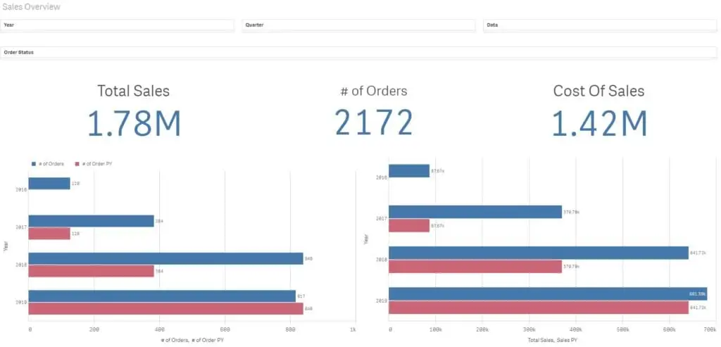
This may sound obvious, but when it comes to analytics and visualizations, the less elements you have in your application to analyze the better. You will get +100 bonus points if you’ve thought through the setup and insights are presented “at a glance” for your customers.
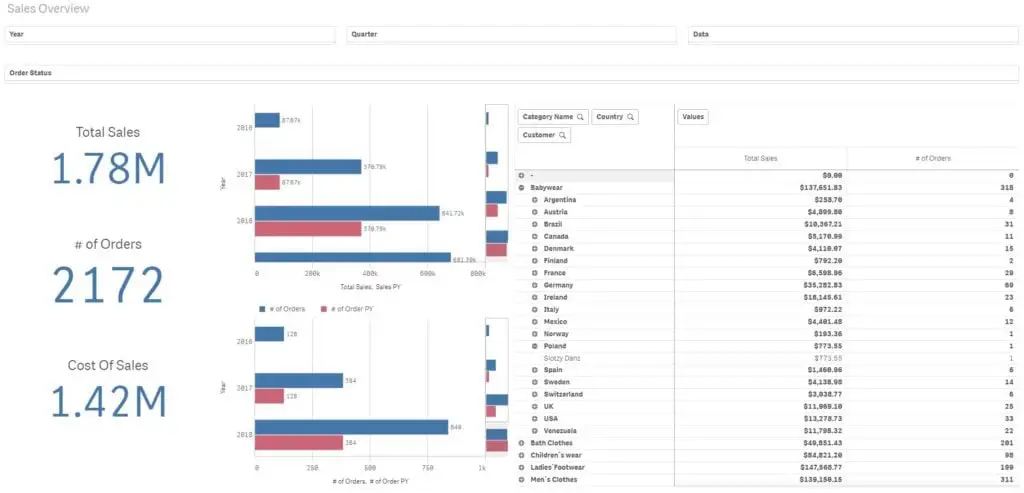
Based on my experience, there exists this strange pursuit to add as many details to a single view as possible. When you will sit down and think about why? for a while it can be quite understandable (another post).
In general, let’s not overwhelm users with information. Please try to distill for them essentials and give them possibility to dig into the details on their own.
Fair Enough

You may consider splitting that to separate parts

Effective visualization
What is the main purpose of preparing visualization based on data? I think we will all agree that the goal is to bring value to consumers (business users / customers). There is a lot of brilliant and remarkable visualization out there. They were built based on real data to show the possibilities and different (than standard) view on how we can approach data visualization.
Although for me I classify such cases as “work of art visualization” they are bringing value no doubt about that, but it all comes with a price. Time and effort taken to create such awesome creations is in most cases disproportionate to the time and effort spent on standard “business” visualization.
In “real” business world, the faster and with as much actionable insight as possible we will deliver the visualization the better – it doesn’t mean that all of the standard, process and good practices should be broken 🙂
Cash is king. If decision makers can get their hands on real data in a clean and sleek form faster, most likely the more profits it will bring to the company.
As much as I would love to create only “work of art visualization”, I understand that business is business. The end goal should always be to give as much actionable value as possible.
Example of an awesome visualization (for me personally): Axis Group Conflicts In Democratic Republic Of Congo.
Data Quality
Have you heard the expression – garbage in garbage out? People are making business decisions based on what you are providing inside visualizations.
There are numerous examples that totals on charts are not matching, example below:

Source: https://flowingdata.com/2009/11/26/fox-news-makes-the-best-pie-chart-ever/
Of course we can argue, that data quality is an element of data warehouse not a visualization layer. We all make mistakes don’t we, so sometimes something may slip through the data warehouse layer. It’s a good practice to validate results before publishing – please read it as: it’s a necessity.
Consumers can forgive us quite a lot. However if we will constantly bombard them with wrong data, they will start to question the results and insights that they see. Validations will appear / Cross checking / Reconciliations – sometimes it’s a necessity one way or the other yeah I agree. Do we really want that to happen? We as analysts / developers are doing our bests to provide the best possible insights based on customers data that we can, right!
Check the data, make some standardized automated checks if needed. It will cost some money (effort / time) initially, but it can potentially save a lot of trouble later on.
As described in first paragrapghs, I’ve prepared a simple infographic with above 5 points, link here: https://datacraze.pl/5-essential-elements-of-data-visualization/
Please let me know what do you think. Do you have additional points that are crucial from your perspective, what are those?
Want to be up to date with new posts?
Use below form to join Data Craze Weekly Newsletter!
